Interactive Data Visualization for ISO New England Control Room
Real-time capacity deviation monitoring for power grid management
Real-time capacity deviation monitoring for power grid management
I developed an interactive data visualization tool to support the decision-making processes in ISO New England's control center, a high-tech environment resembling a NASA launch room, equipped with numerous monitors displaying critical information about grid management. This tool focuses on capacity deviation, providing actionable insights to control room operators managing the power grid.
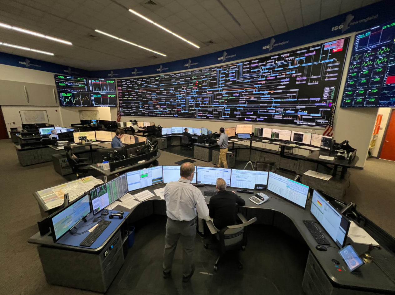
The ISO New England Control Room, where operators monitor and manage the power grid in real-time
Note: The graph below is interactive - you can hover over data points, zoom, and pan. While this demo uses simulated data, the actual implementation processes real-time grid metrics every 5 minutes.
This project bridges technical constraints and user needs, providing a critical tool for real-time monitoring and decision-making in a secure, high-stakes environment. The visualization has streamlined capacity management, enabling operators to respond proactively to grid fluctuations.